
Wallpaper Trends 2027–28: Behind the Print

Updated: Sep 27
Inside the market data, WGSN and Coloro's colour forecast, and the case our studio keeps making: that a wall covering changes how a room feels before it changes how a room looks.
For most of the last decade, walls were something to neutralise. Grey, then greige, then a slightly warmer greige. Wallpaper sat in the "too much" category reserved for a single accent wall, if it appeared at all. That's reversing. Pattern, texture and colour are back on the wall, and for people who specify or sell wallpaper for a living, that reversal is worth understanding in numbers, not just in mood boards.

A mural-scale wallpaper installation mountains and running horses, rendered in fine dotwork — anchoring a richly layered living room.
Wallpaper trends by the numbers: the market data
Wallpaper's return isn't only aesthetic it shows up in the sales data. Estimates vary by research house, which is normal for a fragmented, largely private-label category, but the direction is consistent.
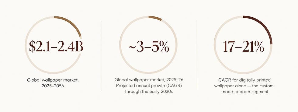
Figures compiled from Fortune Business Insights, IMARC Group and Technavio market research, and Canvas & Ivy retail reporting. Ranges reflect differing methodologies across research firms.
The gap between the flat overall CAGR and the much steeper digitally-printed figure tells the real story: growth isn't coming from more of the same rolls. It's coming from customisation clients who want one wall, one motif, one colourway that exists nowhere else. That's a demand pattern the trade should be pricing and stocking for differently than it did five years ago.
Wallpaper colour trends 2027–28: what WGSN and Coloro forecast
Each year, trend forecaster WGSN and colour system Coloro name a Colour of the Year, plus seasonal Key Colours that ripple from fashion into interiors roughly a year later. For 2027, that colour is Luminous Blue a confident, gender-inclusive blue the forecasters describe as bridging past, present and future, chosen under the defining theme of "interconnectedness" between polarities: nature and technology, online and offline, rational and spiritual.
For the interiors-relevant A/W 27/28 season specifically, the four Key Colours are Russet, Peaceful Lilac, Maize and Deep Green — a palette forecasters describe as answering a consumer need for stability and comfort amid ongoing global uncertainty, built on contrasts of confidence and calm.

The wider shift matters more than any single hue: a confident, saturated blue as the anchor, set against a warm, grounded neutral-and-jewel palette, reads as a deliberate contrast stability next to a hue with real presence, rather than the softer, all-neutral mood of recent seasons. For wallpaper specifically, that favours designs pairing one confident, saturated colourway against warmer, textured grounds, rather than a single flat tone across the whole roll.
Floral wallpaper trends: the return of flora
Running alongside the colour story is a pattern story that's held for several seasons running and shows no sign of easing into 27–28: a swing back toward botanical and biophilic motifs oversized leaves, forest-floor greens, hand-painted-feeling florals after years dominated by geometric minimalism. Deep Green and Russet, in particular, sit naturally on this ground. It reads as a design response to the same instinct behind the colour shift: a wish for interiors that feel grounded, organic and a little imperfect, rather than engineered.

For a studio, this is where colour forecasting and pattern design meet: a Luminous Blue ground with a hand-drawn fern, or a Deep Green botanical on a warm Maize base, translates the season's palette into something a client can actually live inside a room with.
Wallpaper design as surface pattern: a studio's real job
We describe what we do as surface pattern design, not wallpaper printing, and the distinction matters. Aesthetics is a major part of the job scale, repeat, colourway, how a motif turns a corner but it's the visible layer of a decision that's really about how a person is going to feel in that room every day. Pattern is the craft. Meaning is the brief.
A wall isn't a backdrop. It's the thing the room negotiates with every time someone walks into it.
Wallpaper colour psychology: how it actually works
"Colour psychology" gets used loosely, so it's worth being precise about what's established and what's folklore. Two mechanisms are well documented in psychology and design research:
Physiological arousal. Longer, warmer wavelengths (reds, oranges, warm yellows) are consistently associated with slightly higher measured arousal attention, alertness, appetite cues — while cooler, shorter wavelengths (blues, teals, greens) are associated with lower arousal and a calmer state. This shows up reliably across studies, even if the size of the effect varies by person.
Learned and cultural association. A larger share of colour's emotional effect comes from context and conditioning, not wavelength alone what a colour has come to mean in a given culture, a person's own memories, and the object it's attached to. This is why colour meaning shifts across regions and generations, and why the same teal can read as "spa-calm" to one client and "corporate-cold" to another.
Note-This section reflects general design and psychology research and is offered as design guidance, not medical or clinical advice. Anyone with a diagnosed sensory or health condition should work with a qualified professional on material and colour choices.
Wallpaper trends 2027–28: frequently asked questions
What is the wallpaper trend for the 2027–28 season?
A confident, saturated anchor colour — WGSN and Coloro's 2027 Colour of the Year, Luminous Blue set against warmer, grounded tones from the A/W 27/28 palette, alongside a continued swing toward botanical and biophilic patterns and growth in custom, digitally printed designs.
What colours are trending in wallpaper for 2027–28?
Luminous Blue is the headline Colour of the Year for 2027. For A/W 27/28 specifically, the WGSN × Coloro Key Colours are Russet, Peaceful Lilac, Maize and Deep Green a shift toward palettes that read as stable and comforting against a backdrop of global uncertainty.
Does wallpaper colour actually affect mood?
There's a genuine evidence base for colour affecting arousal and perceived calm, alongside a large learned and cultural component. It's a real, useful input for a specification decision not an exact science, and not a substitute for asking the client how they want the room to feel.
Is floral or botanical wallpaper still trending?
Yes botanical, biophilic and hand-drawn florals remain one of the strongest pattern categories heading into 2027–28, pairing especially well with Deep Green and Russet from the season's palette
What does a surface pattern studio do, exactly
A surface pattern studio designs the repeat, scale and colourway of a pattern for wallpaper, fabric or other surfaces starting from how a space should feel, then building the aesthetic around that intent.Wallpaper's return isn't a nostalgia trend. It's a more considered relationship with the wall one backed by real market growth, a coherent colour forecast, and a genuine case that what's on a wall shapes how a room, and the people in it, feel.
Explore more at Rococo Design
Explore more of the season's colours and patterns at our surface pattern studio, where you can check out our in-house designs and if you're after something specific, a custom colourway or a fully bespoke pattern, get in touch through our website. We'll be happy to guide you.


Comments